The Canadian Army has unveiled a new icon and tagline in an effort to rebrand the organization.
A video posted to social media shows the camera moving through camouflage material to unveil a brown and tan pixelated icon that includes a maple leaf, moose, and an oblong extension on the other side of the moose.
The tagline reads, “Strong. Proud. Ready.”
However, not everyone was happy with the change, with some criticizing the new look.
Conservative MP Dan Albas said there was a reason the icon was unveiled before a weekend.
“When something Government related is released on a Friday versus a Monday, more often than not there is a good reason why,” he said in a May 3 post on X, formerly Twitter. “This is no exception.”
Related Stories

Another MP questioned whether it was a joke.
“Upon reflection, this has to be a joke. This is a prank, right?” Conservative MP Michelle Rempel Garner posted on X. “Like haha got you made you guys look at our Twitter account sort of thing, right?”
The Canadian Army quickly responded to questions about the rebranding effort.
“The Canadian Army has not changed its official logo. We remain proud of our official emblem,” they said in a subsequent social media post.
“The icon launched today is a supplementary design only that will be used in the bottom left corner of certain communications products and in animations for videos.”
A spokesperson told The Epoch Times in an email that the icon was developed by a Department of National Defence internal graphic design team, with no cost to taxpayers.
“The icon was developed without additional funds or involvement of external companies,” the spokesperson said. “It was developed by DND’s internal graphic design team, and this icon comes at zero expense to the taxpayer.”
New Uniforms
New patterns for Canadian Army uniforms have also been released to coincide with the new branding, the Army said.
“The icon is intended to highlight the colours used in that pattern. In particular, the icon resembles the pixels, in shades of brown, topped by a maple leaf and was extracted from this pattern,” the email said.
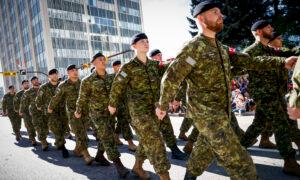
The new Canadian Disruptive Pattern Multi-Terrain (CADPAT MT) is now being used in the production of combat uniforms.
It was designed by Defence Research and Development Canada (DRDC) with software, the Canadian Army said. The process includes taking digital photos from different operating environments and pixelating them.
An updated design will help prevent detection for soldiers, and is “among the most effective camouflage patterns worn by any army in the world,” according to a news release.
“CADPAT (MT) provides outstanding performance across the widest range of environments in which Canadian soldiers are likely to operate,” the Army release said.
“This pattern reduces the likelihood of detection from a greater range of technologies and in the widest range possible of operational environments.”
The new uniforms started being issued in February, according to the release. The Army expects all Canadian Armed Forces members will be wearing the new design in about two years.


 English (US) ·
  Turkish (TR) ·